Tilda & Cacao
Branding, Illustration & Packaging Design
Requirement
Tilda & Cacao is a consciously crafted chocolate brand specialising in stone ground nib-to-bar chocolate. First launched in 2018, it aimed to develop a comprehensive brand identity reflecting its artisanal creations, versatile for both packaging and the potential for chocolate café. They realised their dream opening the café in 2020 after the lockdowns and the success of their chocolate bars.
Response
Creating an encompassing brand identity was the core focus. The project entailed crafting a logo, defining a vibrant colour palette, developing a unique illustration style, and selecting fitting typography. To visually communicate product information, custom iconography was created. A suite of packaging designs, meticulously handcrafted akin to the chocolates themselves, was curated. Each package design was infused with custom illustrations, mirroring the distinctive taste and ingredients of the chocolates.
Outcome
The unified brand identity seamlessly integrated into packaging and café, telling a compelling story of artisanal craftsmanship and natural ingredients. Custom iconography clarified product details, while handcrafted packaging mirrored the care invested in the chocolates. This cohesive identity boosted Tilda & Cacao's presence, resonating with its values and enhancing market appeal, leading to increased customer engagement and loyalty.


Thoughtful, totally compostable design
Packaging inspired by flavours


Say Hello!
Looking for a freelance graphic designer to collaborate with? I’d love to hear from you.
Related Work
-
![Graphic Design and branding suite for Alto Health applied to digital and print]()
Alto Health – Branding & Website Design for Sydney based General Practice
-
![]()
Change Coffee – Branding & Packaging for World Vision Social Enterprise
-
![Shhh Silk — E-Commerce Branding & Packaging shown in artistically arranged image with a silk pillow]()
Shhh Silk — E-Commerce Brands Rebrand & Packaging Design
-
![Animation for Sparkways Rebrand showcasing the logo and typography]()
Sparkways – Rebrand for Youth Education Not-for-profit
-
![Horizon NL - Renewable Energy Provider Branding logo placed on picturesque setting of windmills and solar panels]()
Horizon NL — Renewable Energy Provider Branding
-
![West Recruitment – Branding showcased across letterhead, business cards and brochure]()
West Recruitment – Branding & Icon Suite Design
-
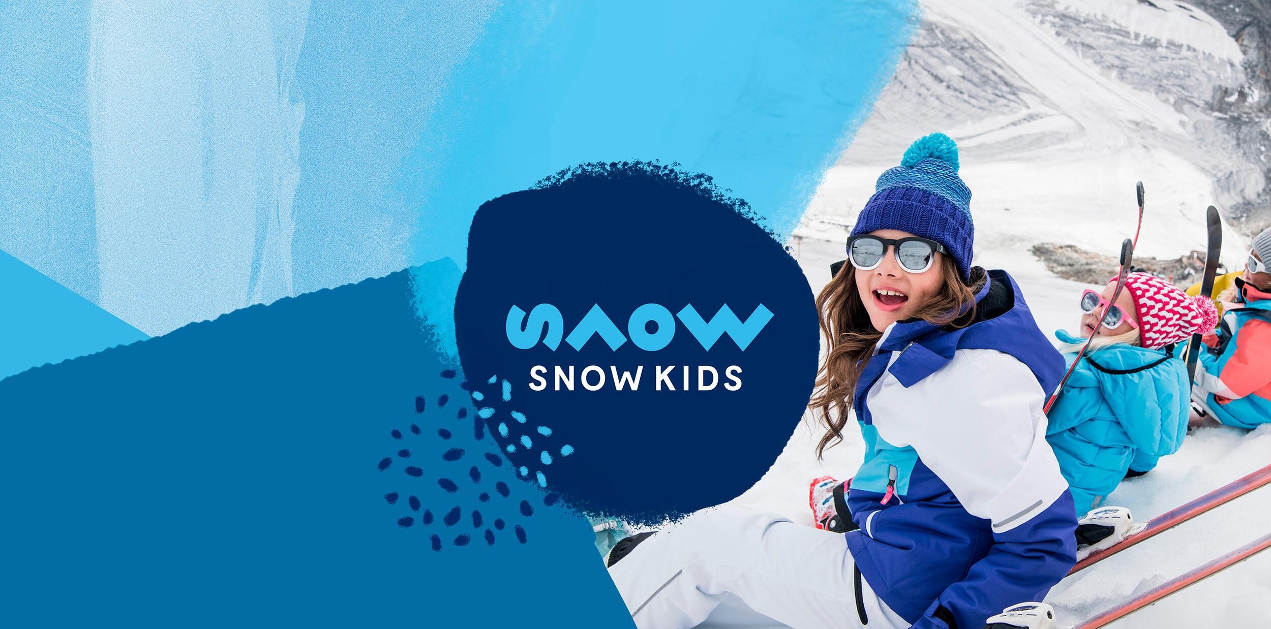
![Snow Kids logo design for the brand shown with blue shapes and young trendy kids wearing the gear]()
Snow Kids – Branding for Children's Adventure Clothing Ecommerce Store
-
![ION BLUE - Renewable energy introduction animation car driving to charge station]()
ION BLUE - Renewable energy introduction animation
-
![]()
Noble Bootleggers – Gin Distillery Branding, Illustration & Packaging Design
-
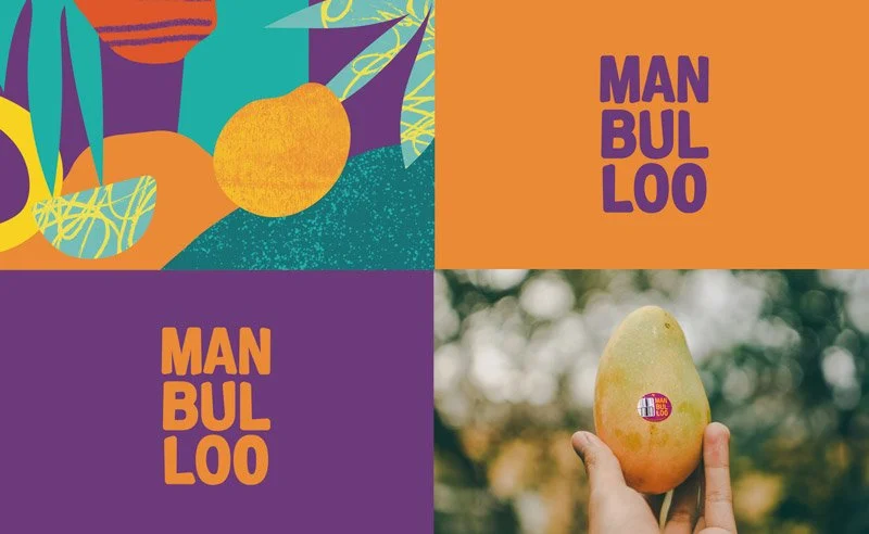
![Manbulloo Mango Branding & Packaging design on mango box isolated on blue background]()
Manbulloo Mango Farm Production Branding & Packaging Design
-
![Costafox — Logo design and branding shown with gold foil on blue stock]()
Costafox — Property Developer Branding, Website & Custom Corporate Font Design