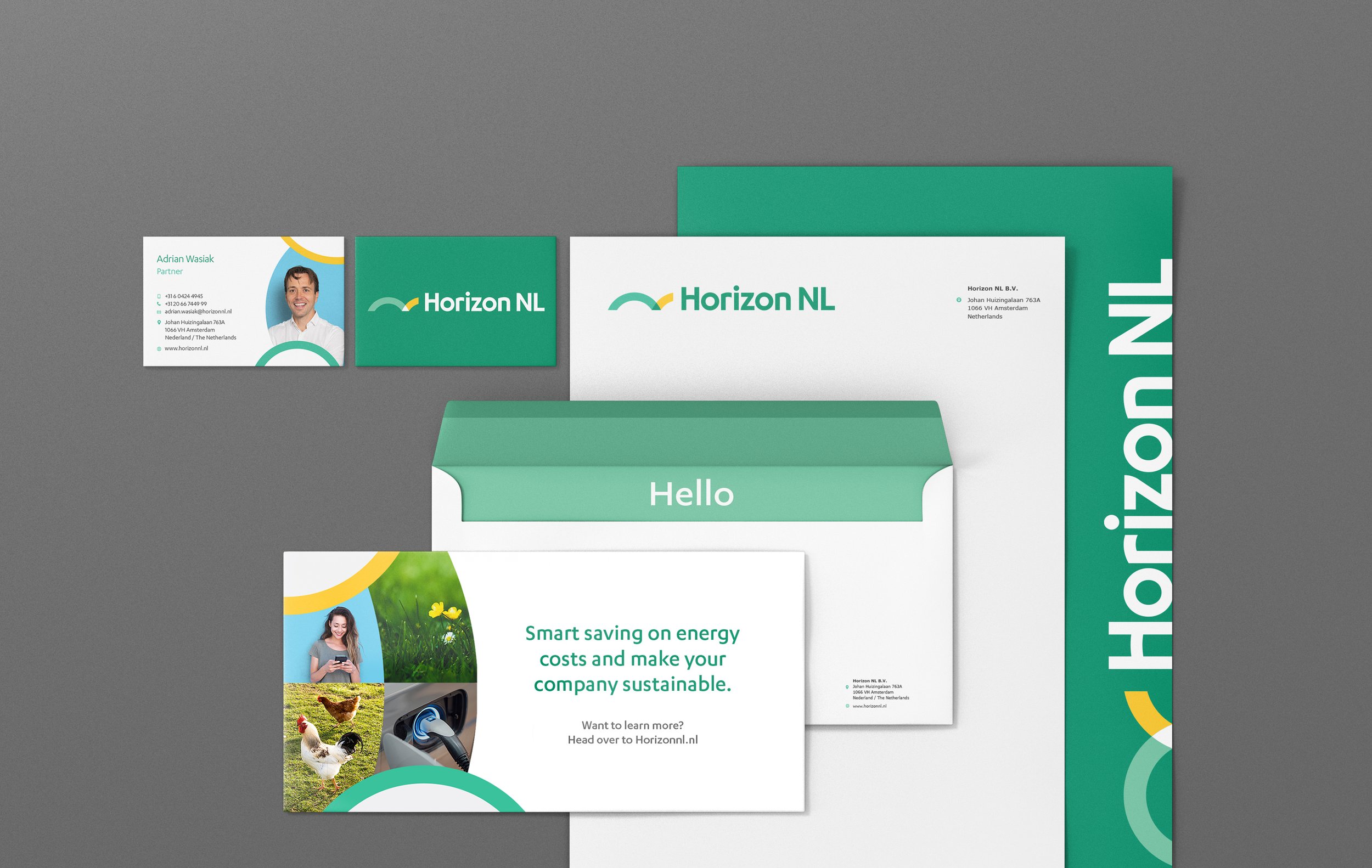
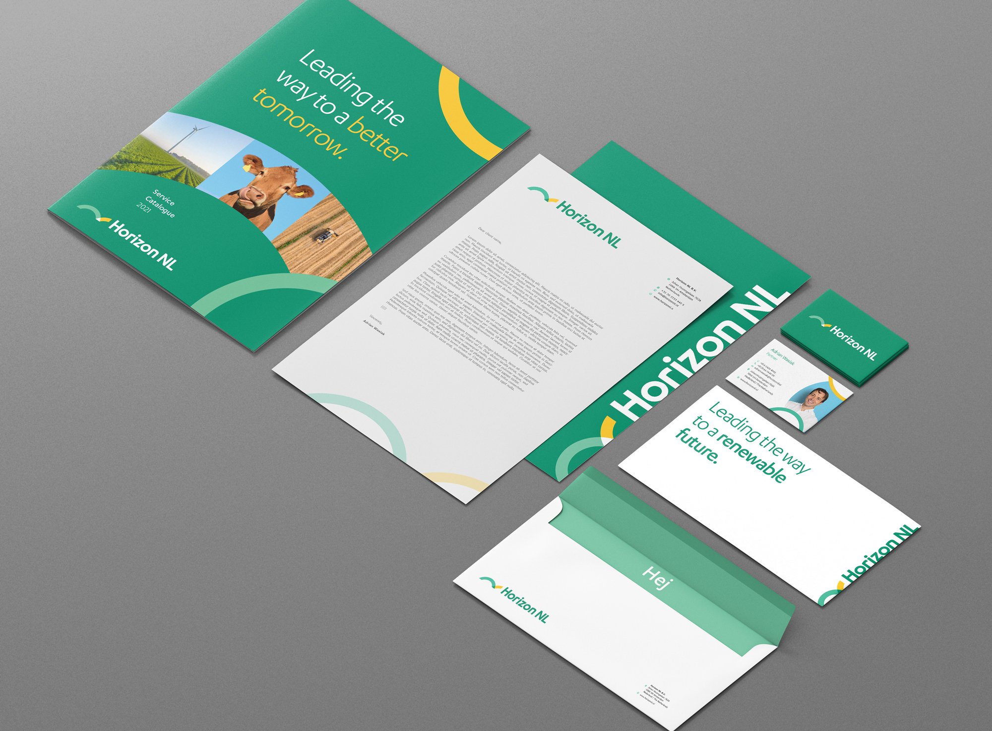
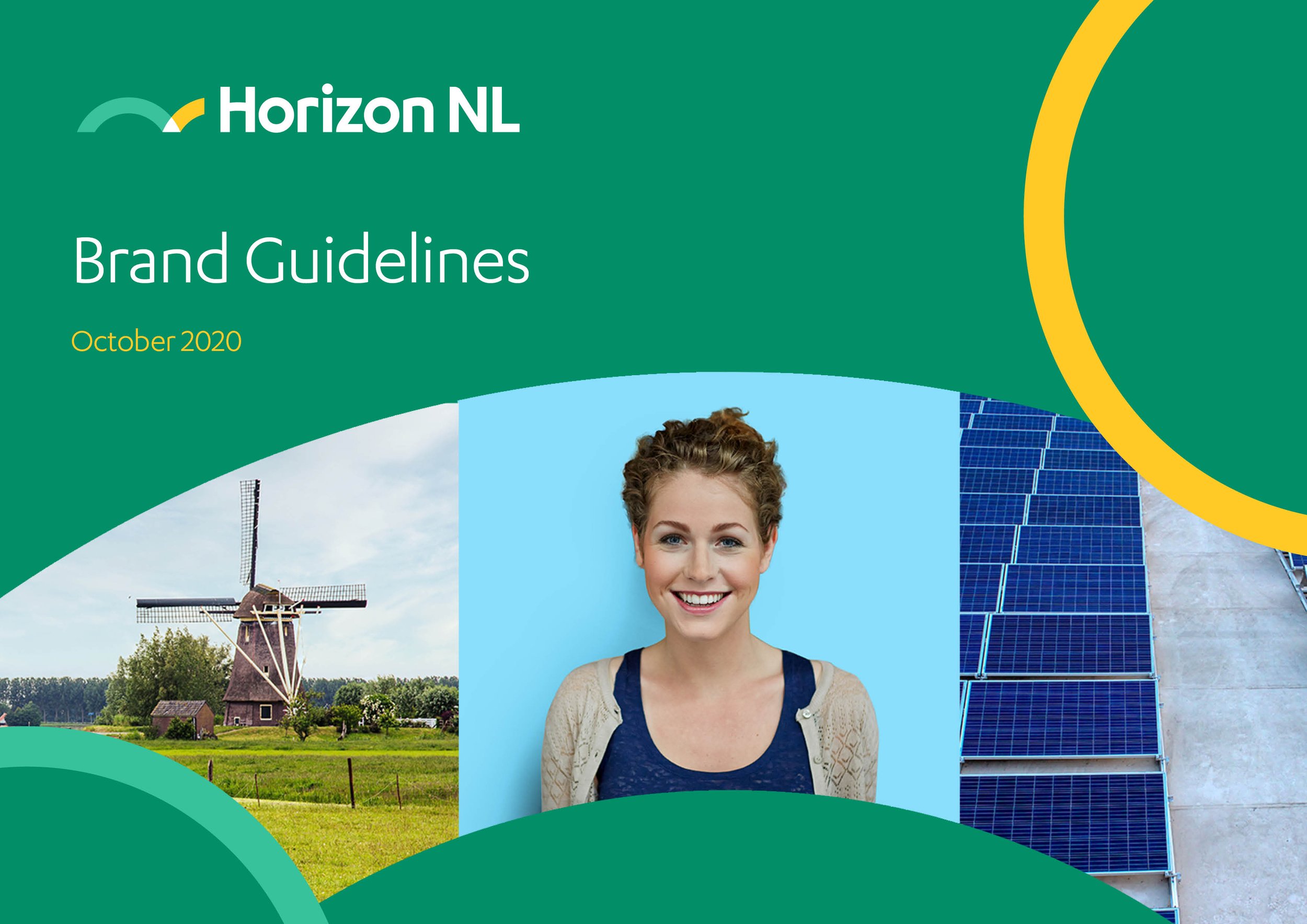
Horizon NL – Amsterdam, Renewables Business
Branding, Website & Templates
Requirement
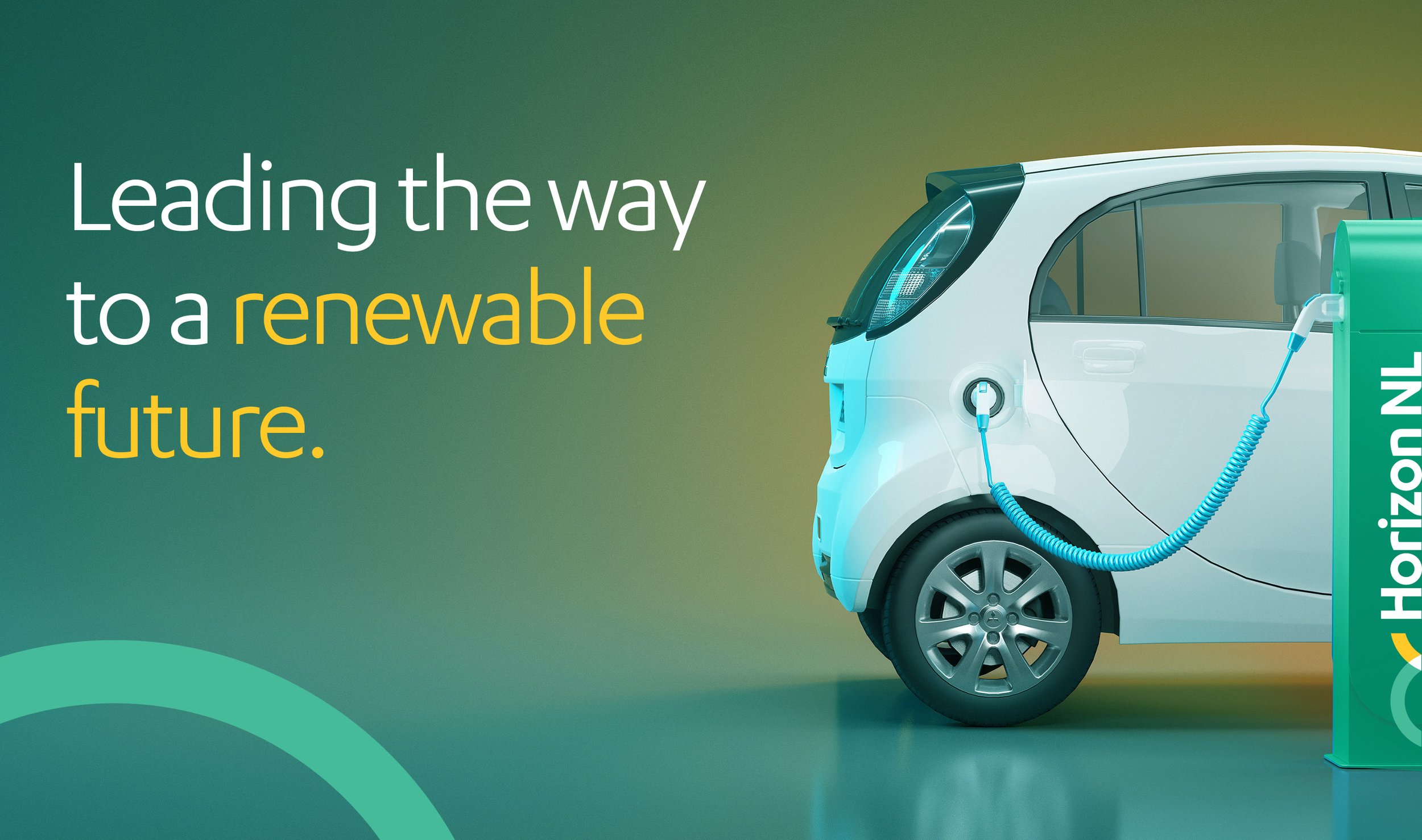
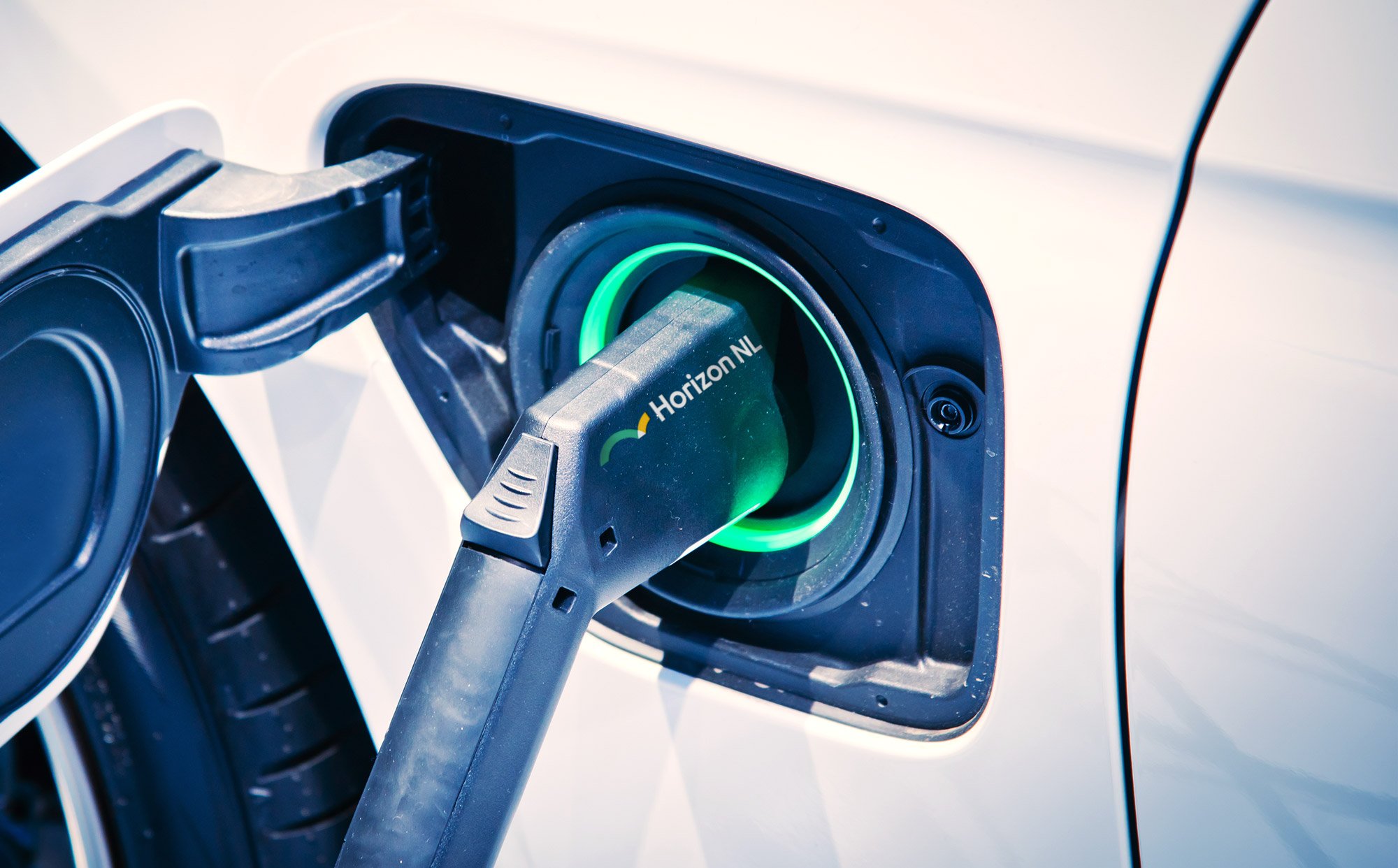
Horizon NL, a Dutch renewable energy company, faced fierce competition in an industry dominated by traditional entities. Their challenge was clear: to rebrand and capture a fresh, sustainable identity while maintaining professionalism. The goal was to set Horizon NL apart as a dynamic and charismatic player in the renewable energy sector.
Response
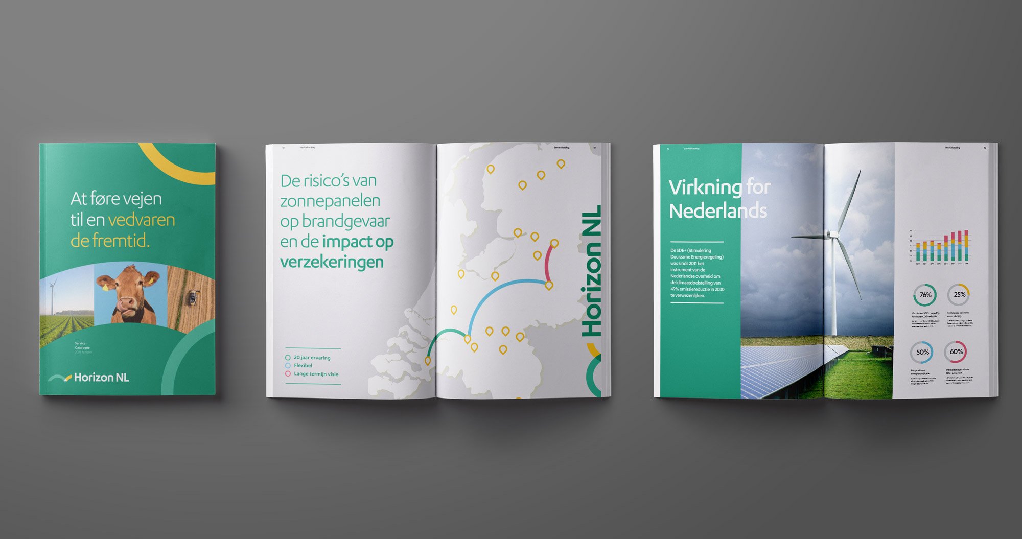
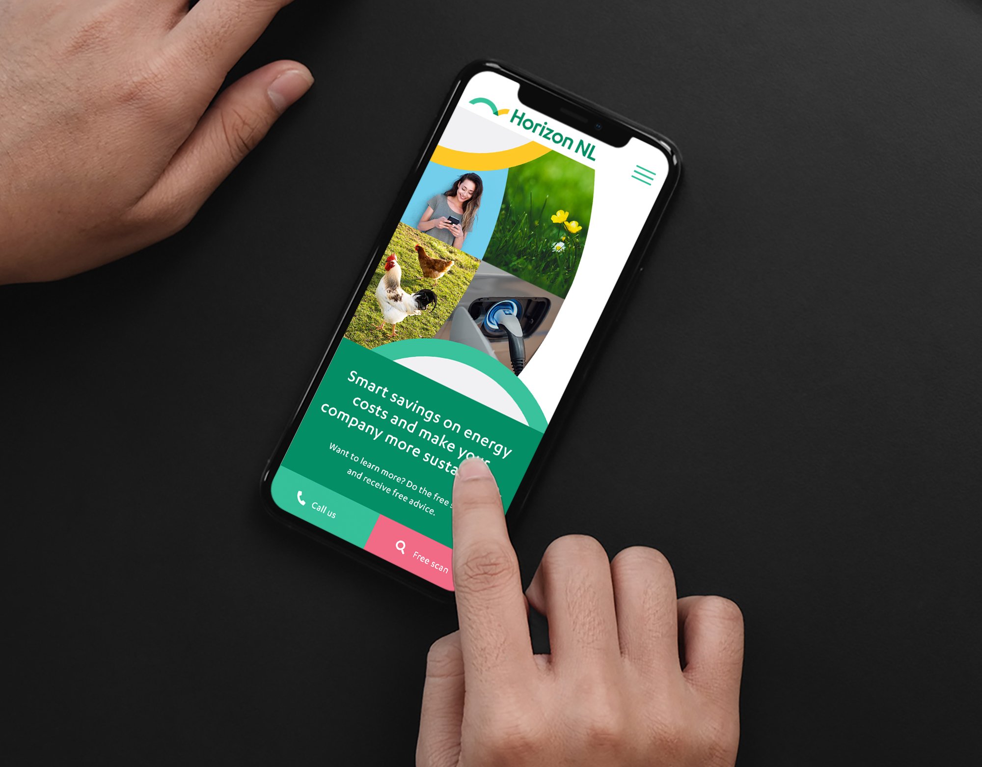
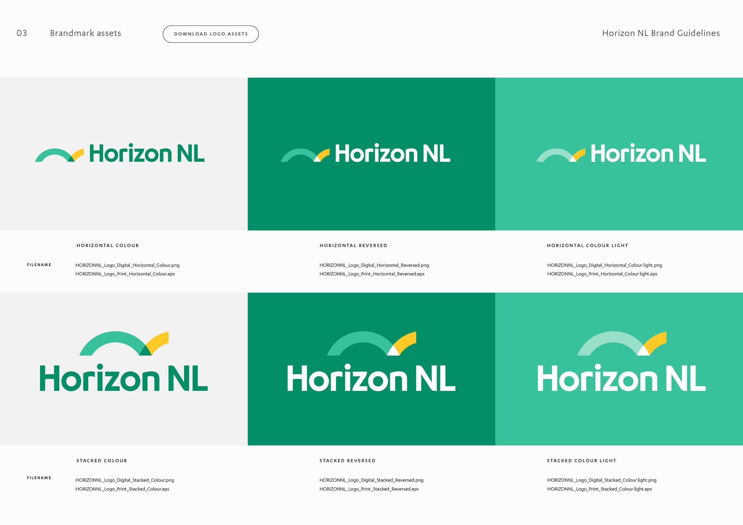
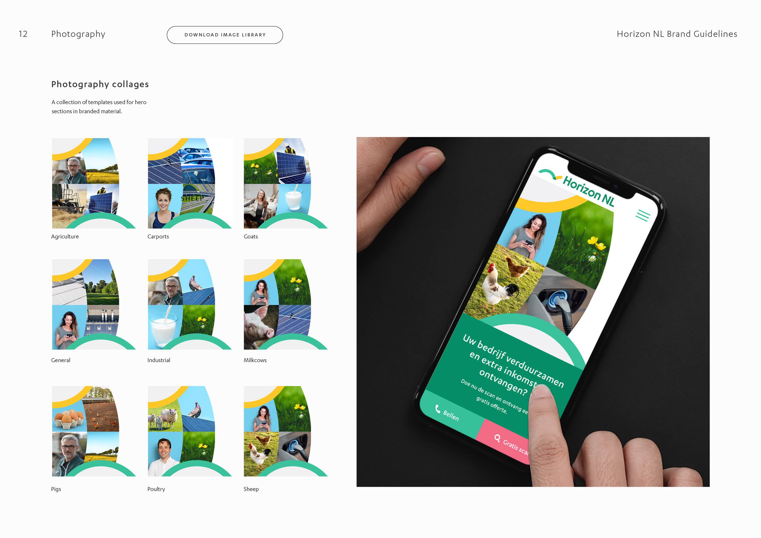
The rebranding journey of Horizon NL began with a deep dive into their commitment and community values. These became the foundation of their brandmark, symbolizing connection and dedication. Incorporating the delta symbol represented measurable change and innovation, showcasing Horizon NL's commitment to progress in both business and renewable energy sectors
Outcome
The revitalised brand of Horizon NL swiftly gained traction, attracting attention and projects. Since its relaunch, the company has led initiatives driving the widespread adoption of renewable energy solutions across the Netherlands. With an innovative identity, Horizon NL is effectively steering the transition to a cleaner, greener future, making a substantial impact in the industry.
Work completed with Storyfolk Studio
Say Hello!
Looking for a freelance graphic designer to collaborate with? I’d love to hear from you.
Other Work
-
![ION BLUE - Renewable energy introduction animation car driving to charge station]()
ION BLUE - Renewable energy introduction animation
-
![Costafox — Logo design and branding shown with gold foil on blue stock]()
Costafox — Property Developer Branding, Website & Custom Corporate Font Design
-
![Graphic Design and branding suite for Alto Health applied to digital and print]()
Alto Health – Branding & Website Design for Sydney based General Practice
-
![]()
Change Coffee – Branding & Packaging for World Vision Social Enterprise
-
![West Recruitment – Branding showcased across letterhead, business cards and brochure]()
West Recruitment – Branding & Icon Suite Design
-
![Shhh Silk — E-Commerce Branding & Packaging shown in artistically arranged image with a silk pillow]()
Shhh Silk — E-Commerce Brands Rebrand & Packaging Design
-
![Animation for Sparkways Rebrand showcasing the logo and typography]()
Sparkways – Rebrand for Youth Education Not-for-profit
-
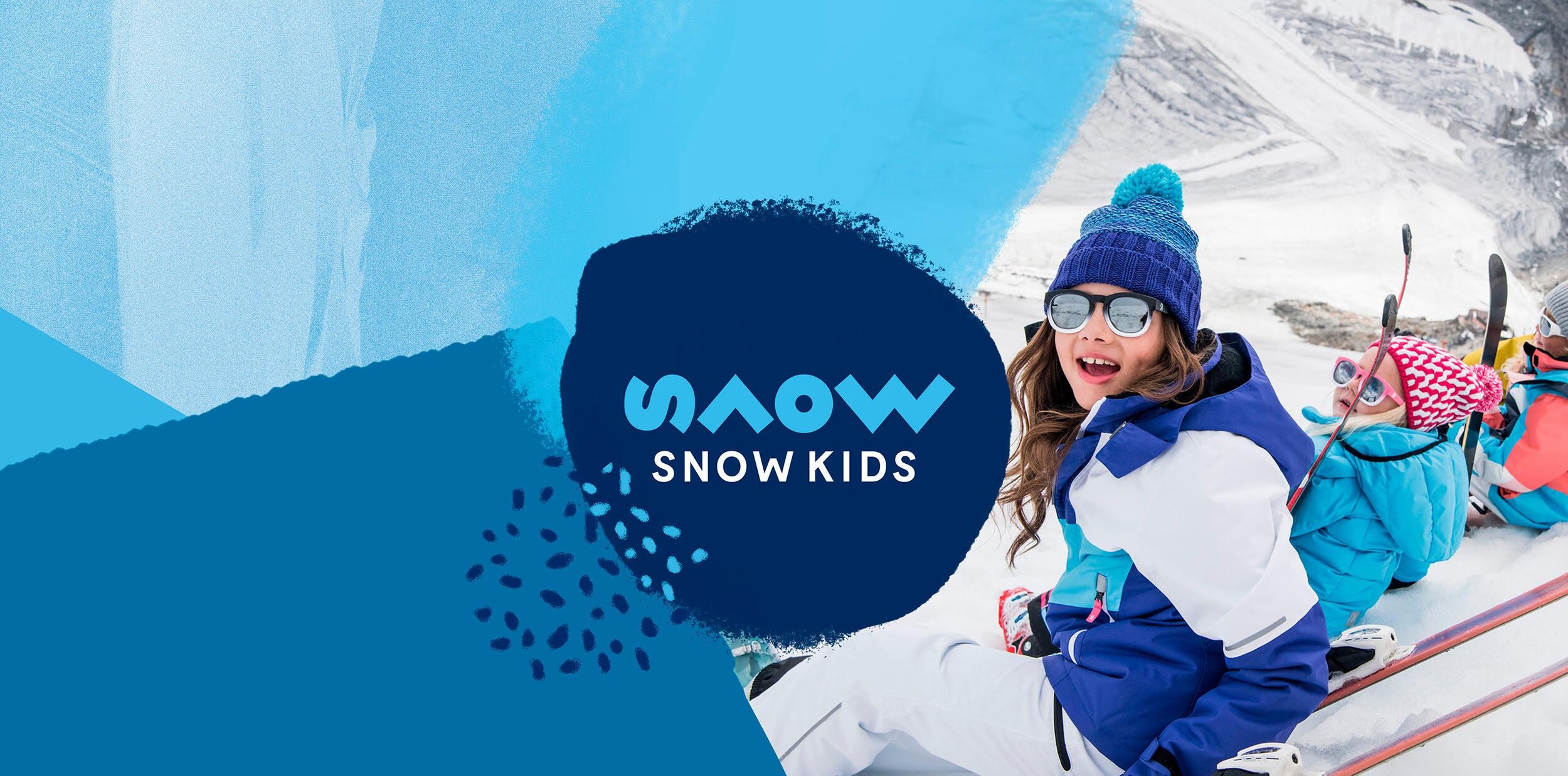
![Snow Kids logo design for the brand shown with blue shapes and young trendy kids wearing the gear]()
Snow Kids – Branding for Children's Adventure Clothing Ecommerce Store
-
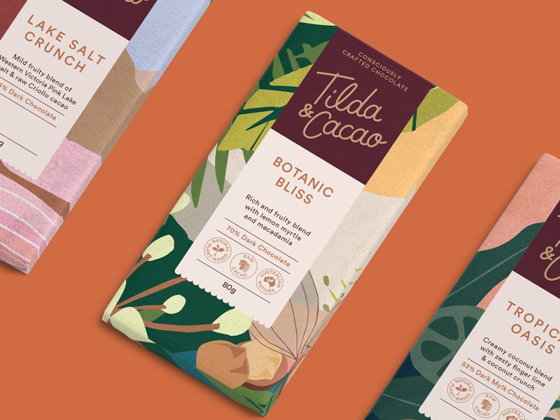
![3 vibrant Chocolate packaging design's shown on orange coloured background for Tilda & Cacao]()
Tilda & Cacao – Branding & Compostable Packaging Design for Hand Crafted Chocolate
-
![]()
Noble Bootleggers – Gin Distillery Branding, Illustration & Packaging Design
-
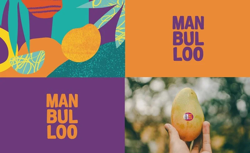
![Manbulloo Mango Branding & Packaging design on mango box isolated on blue background]()
Manbulloo Mango Farm Production Branding & Packaging Design