
Sparkways — Youth NFP Education Rebrand
Branding, Brand Guidelines & Templates
Requirement
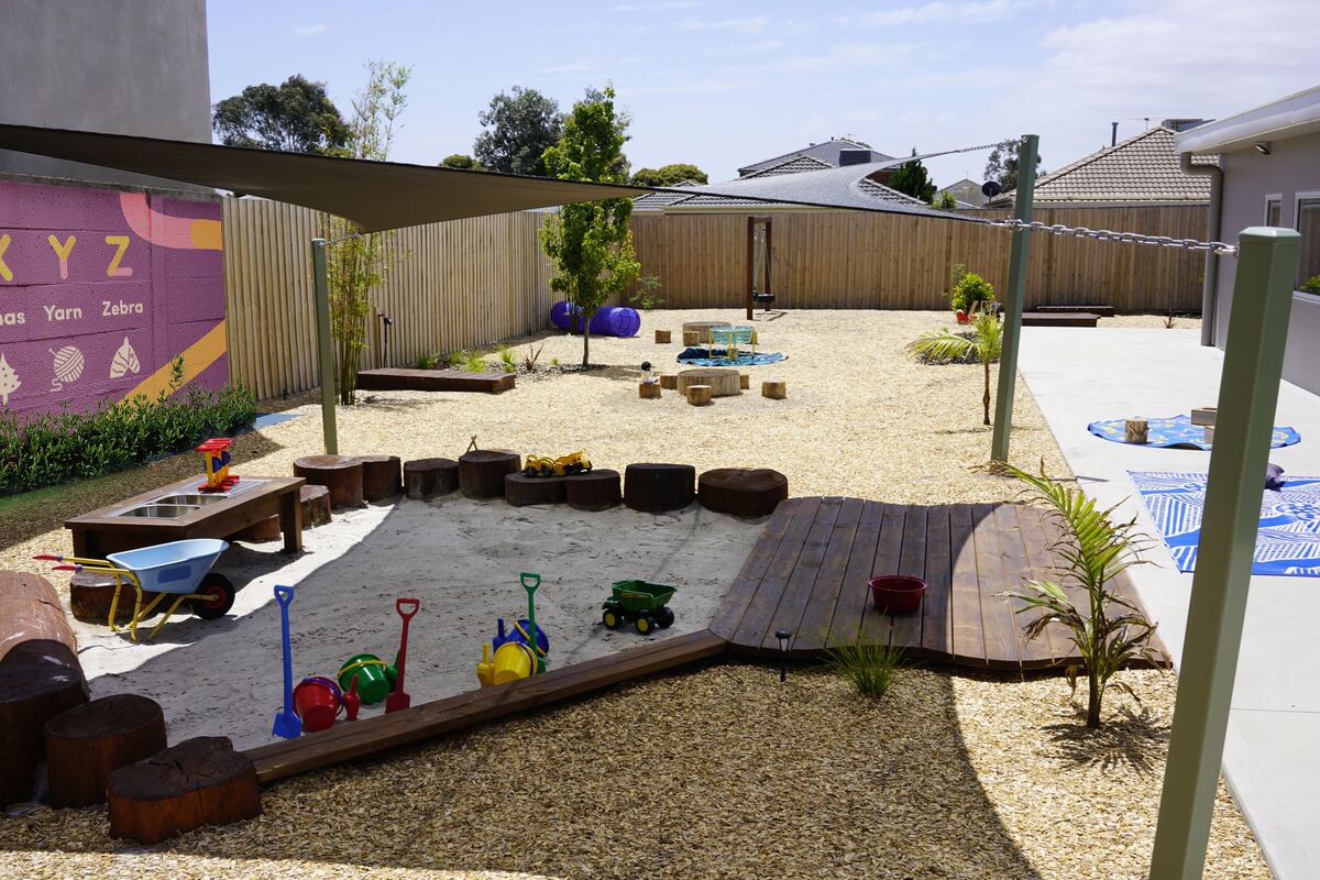
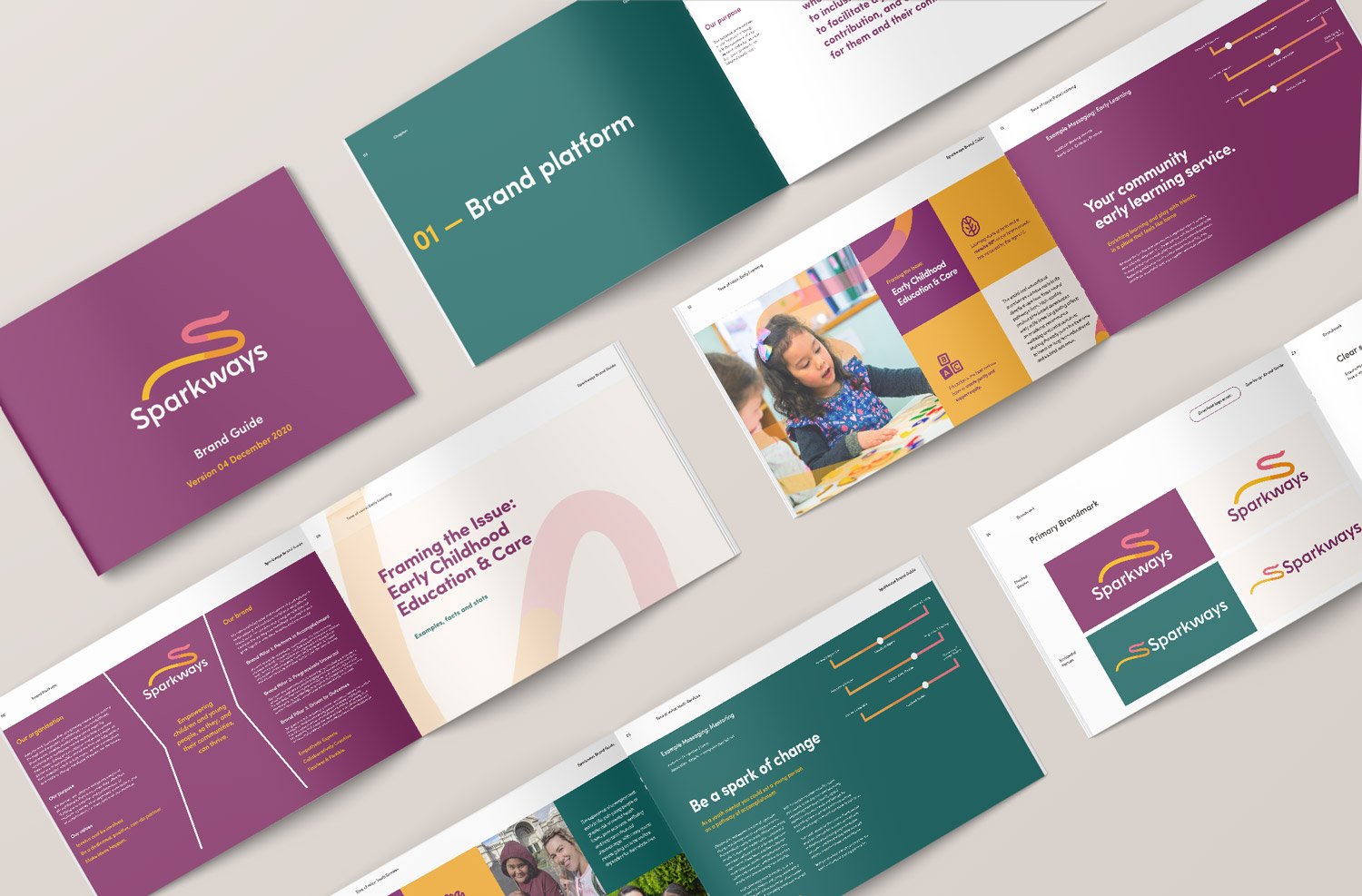
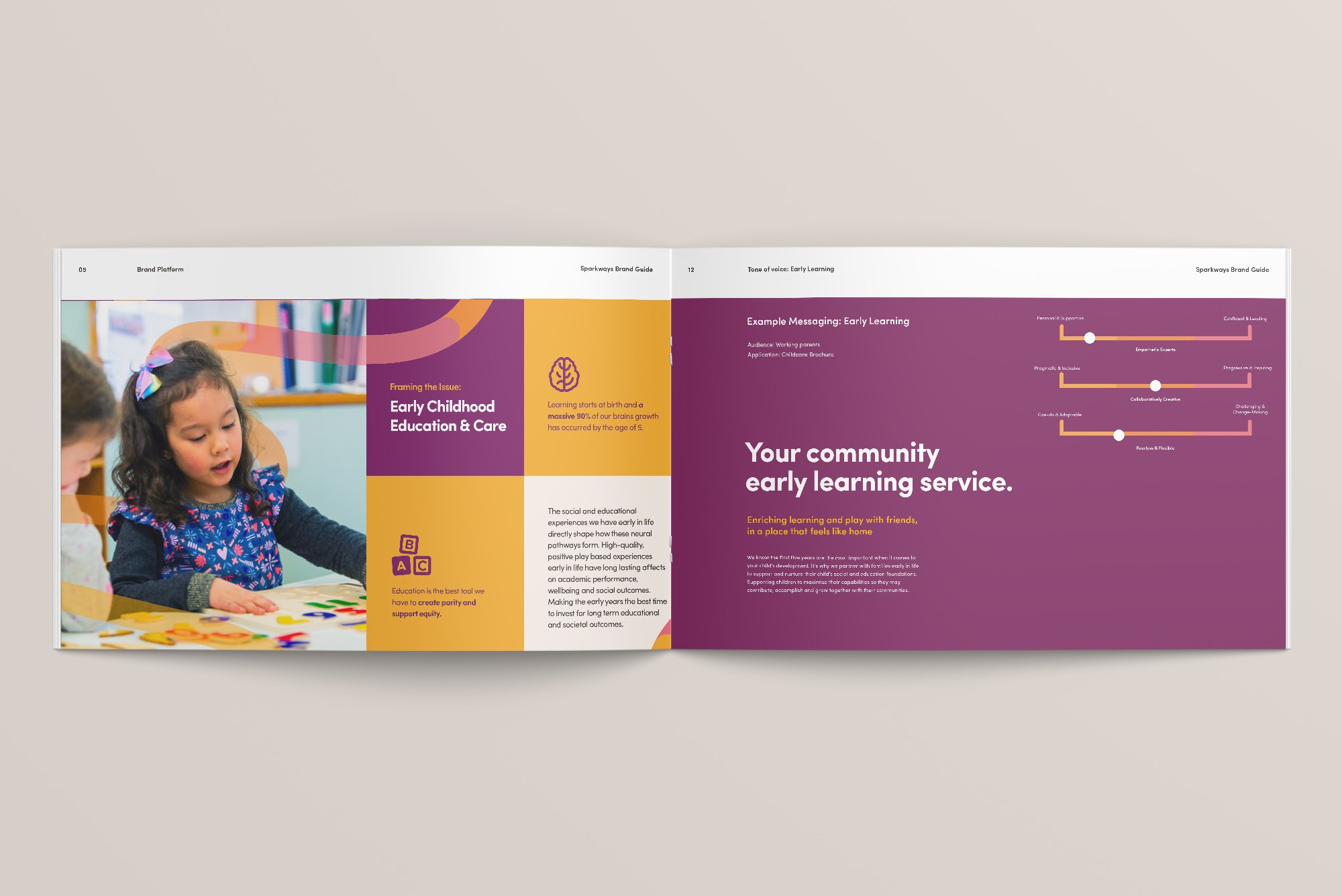
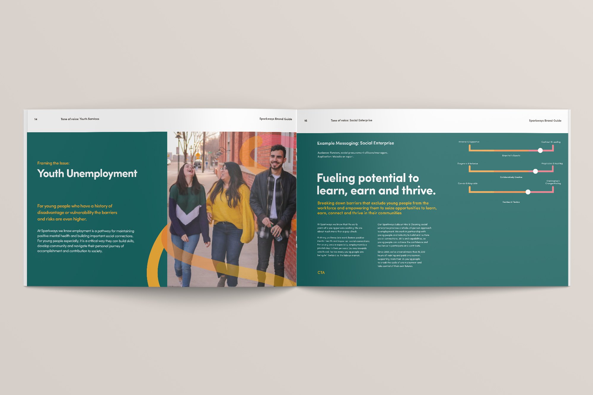
Sparkways, a longstanding educational not-for-profit with a 137-year legacy, faced the challenge of modernising while preserving its rich history. Tasked with supporting early learning and youth services across Melbourne and Australia, they sought a brand refresh to adapt to changing times while staying true to their heritage.
Response
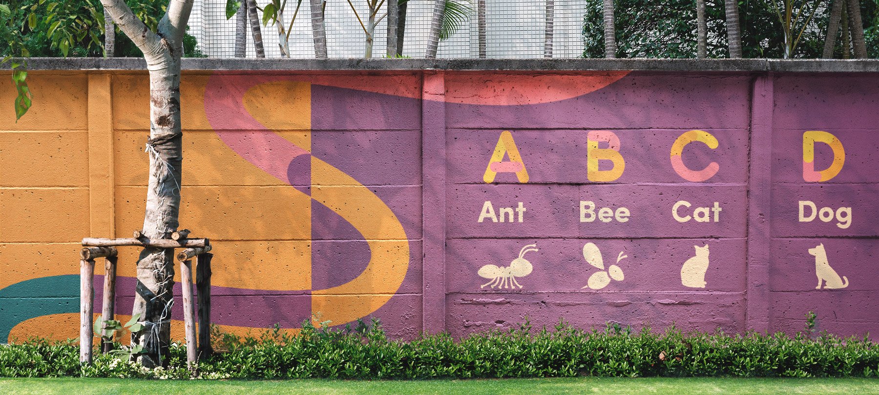
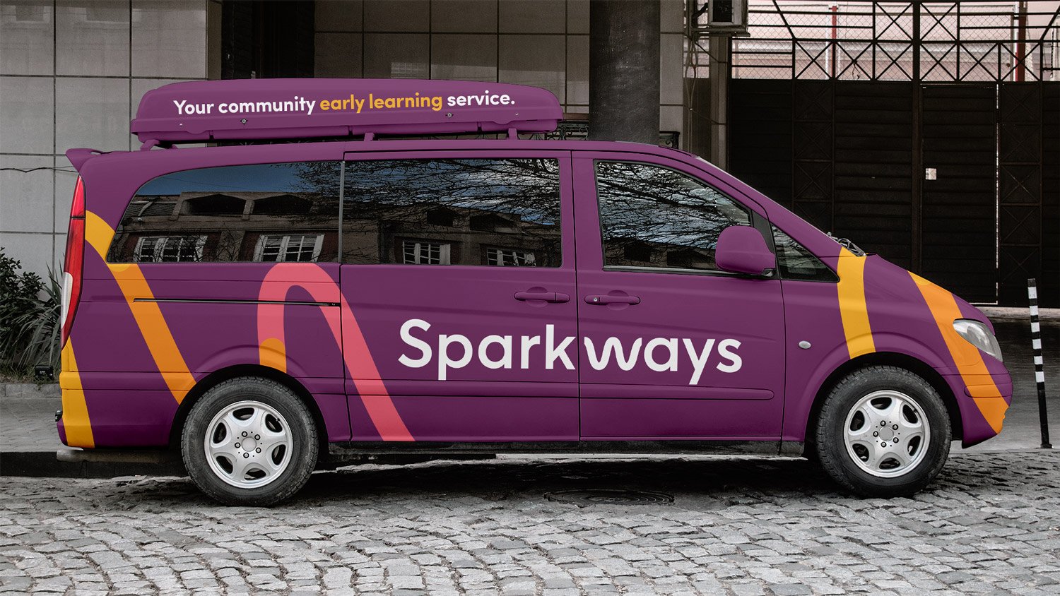
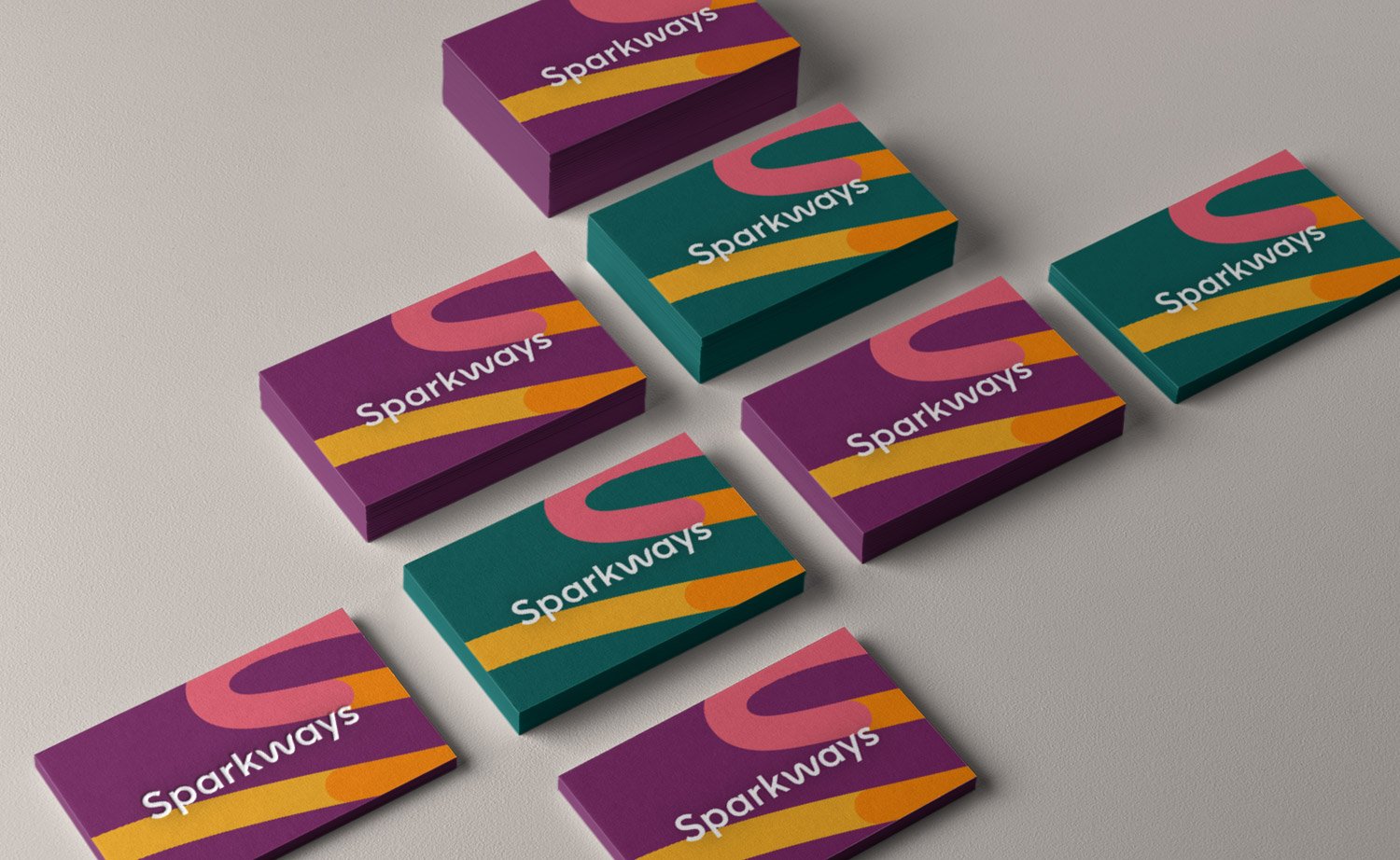
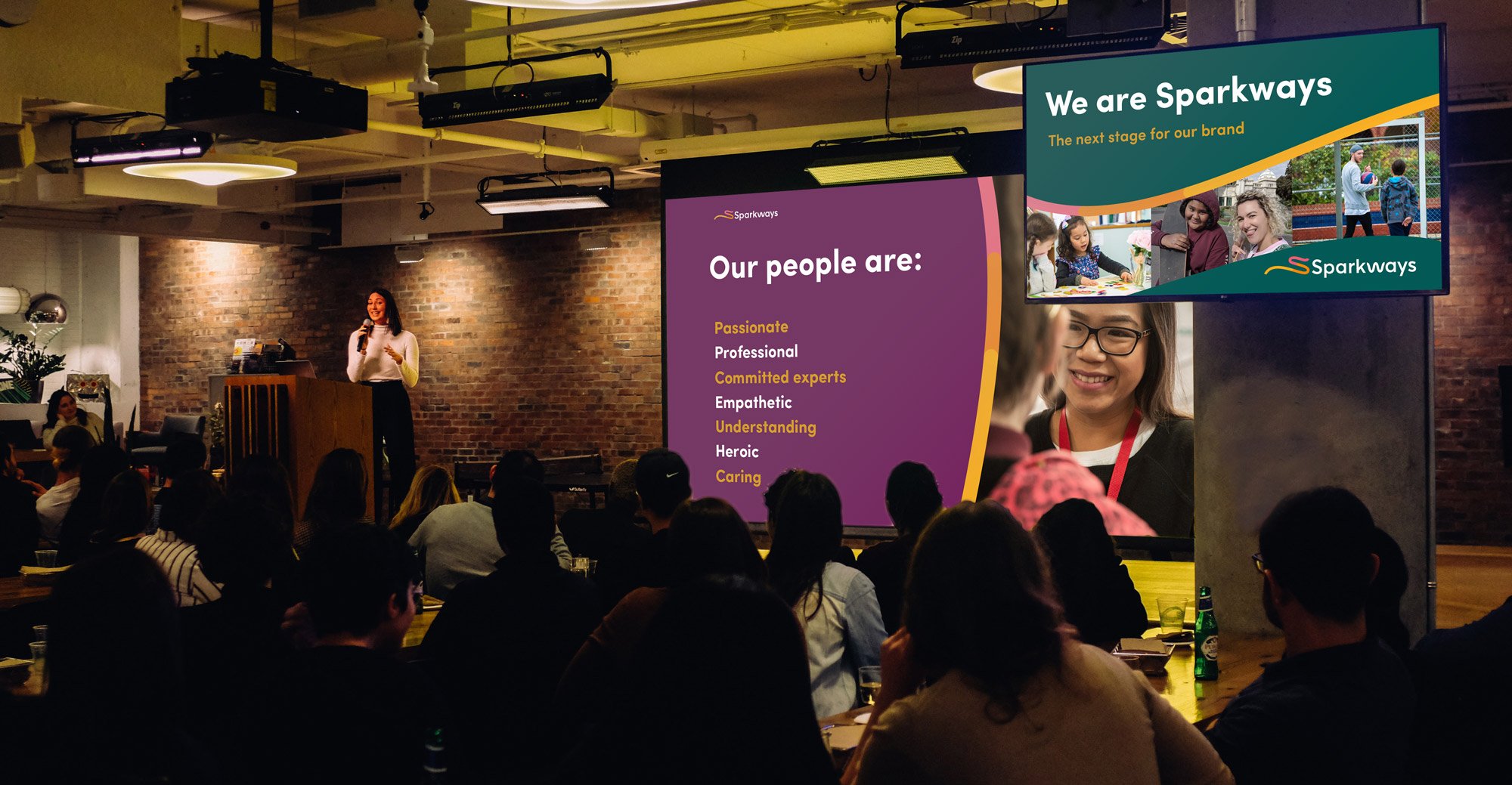
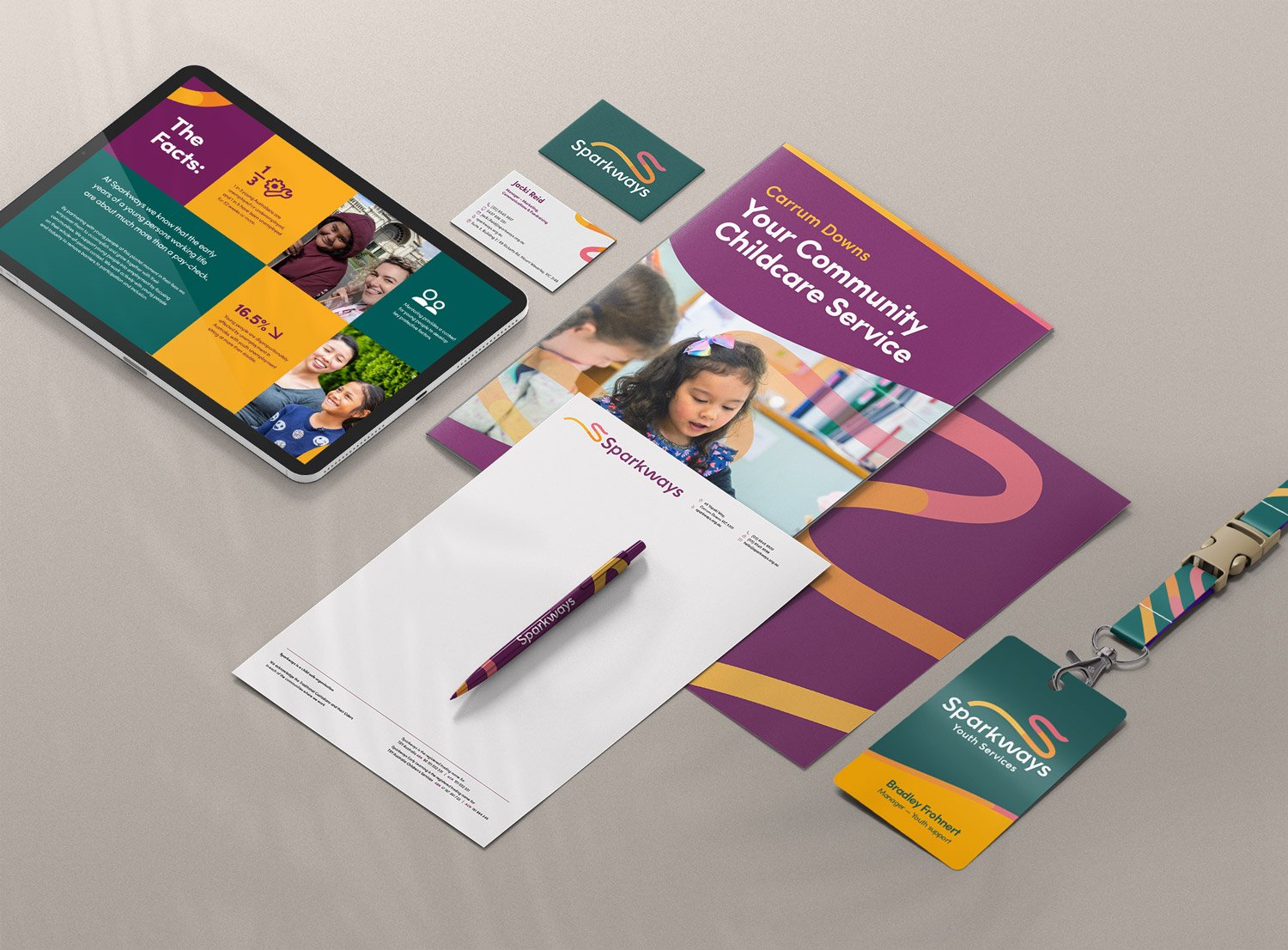
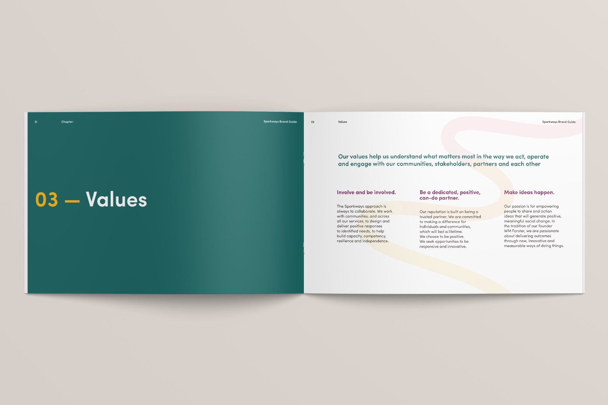
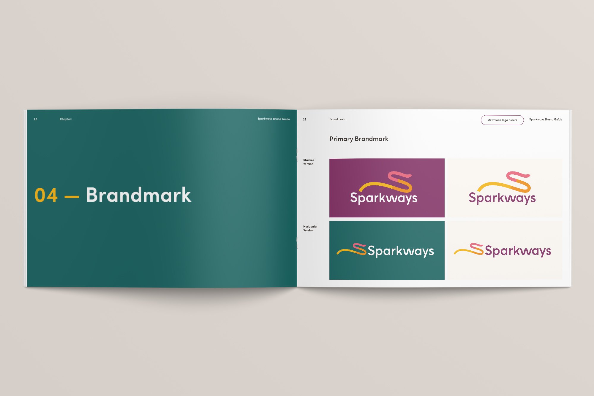
Engaged by Sparkways (formerly TRY Australia), spearheaded a comprehensive brand refresh, focusing on brand identity, iconography, brand guidelines, and collateral. The aim was to encapsulate the essence of sparking educational journeys for children and young people.
Outcome
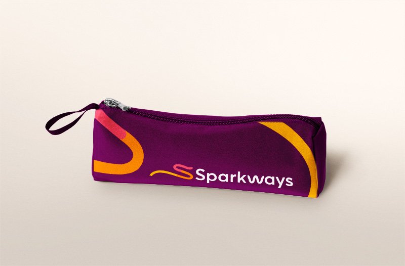
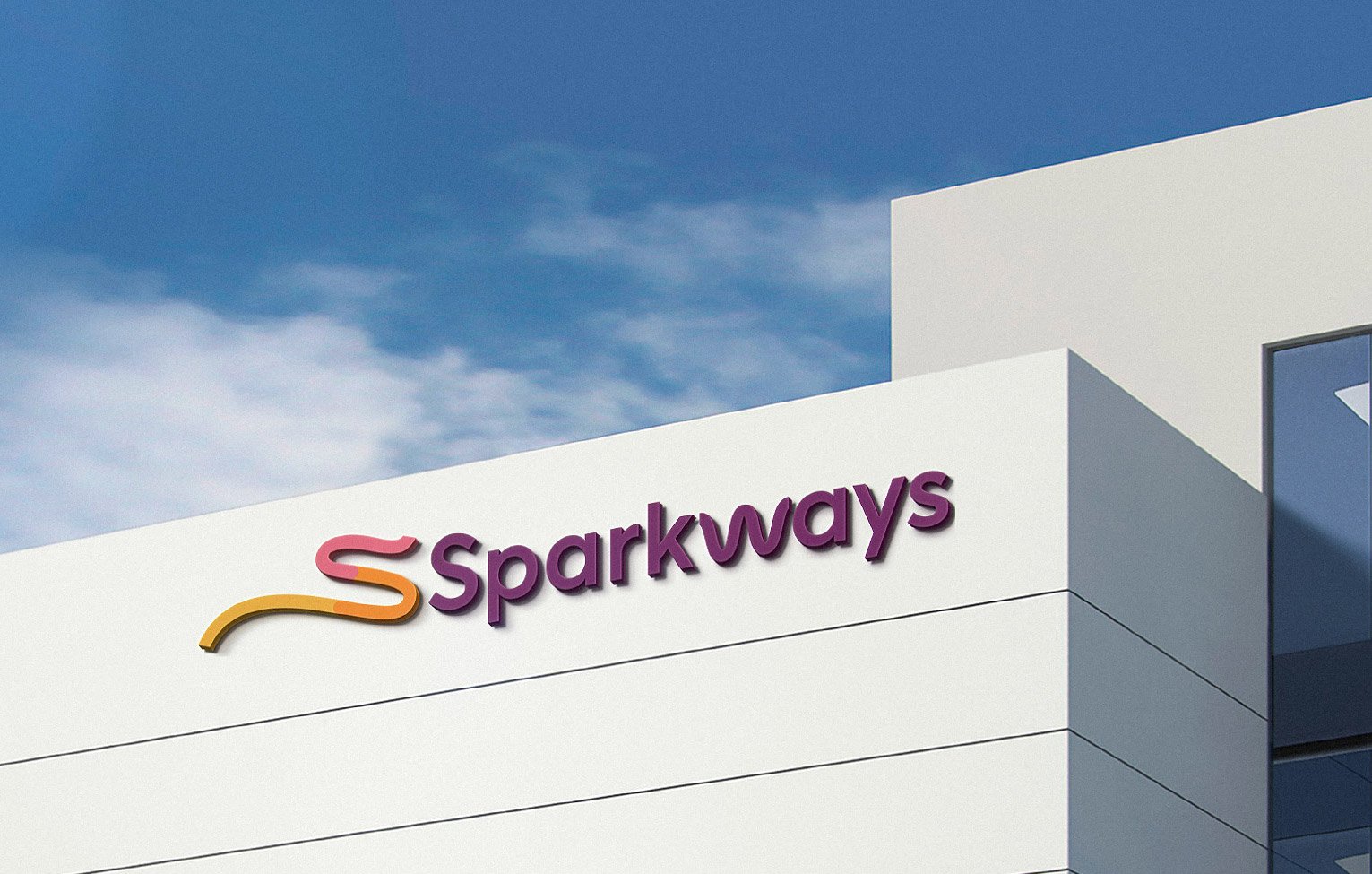
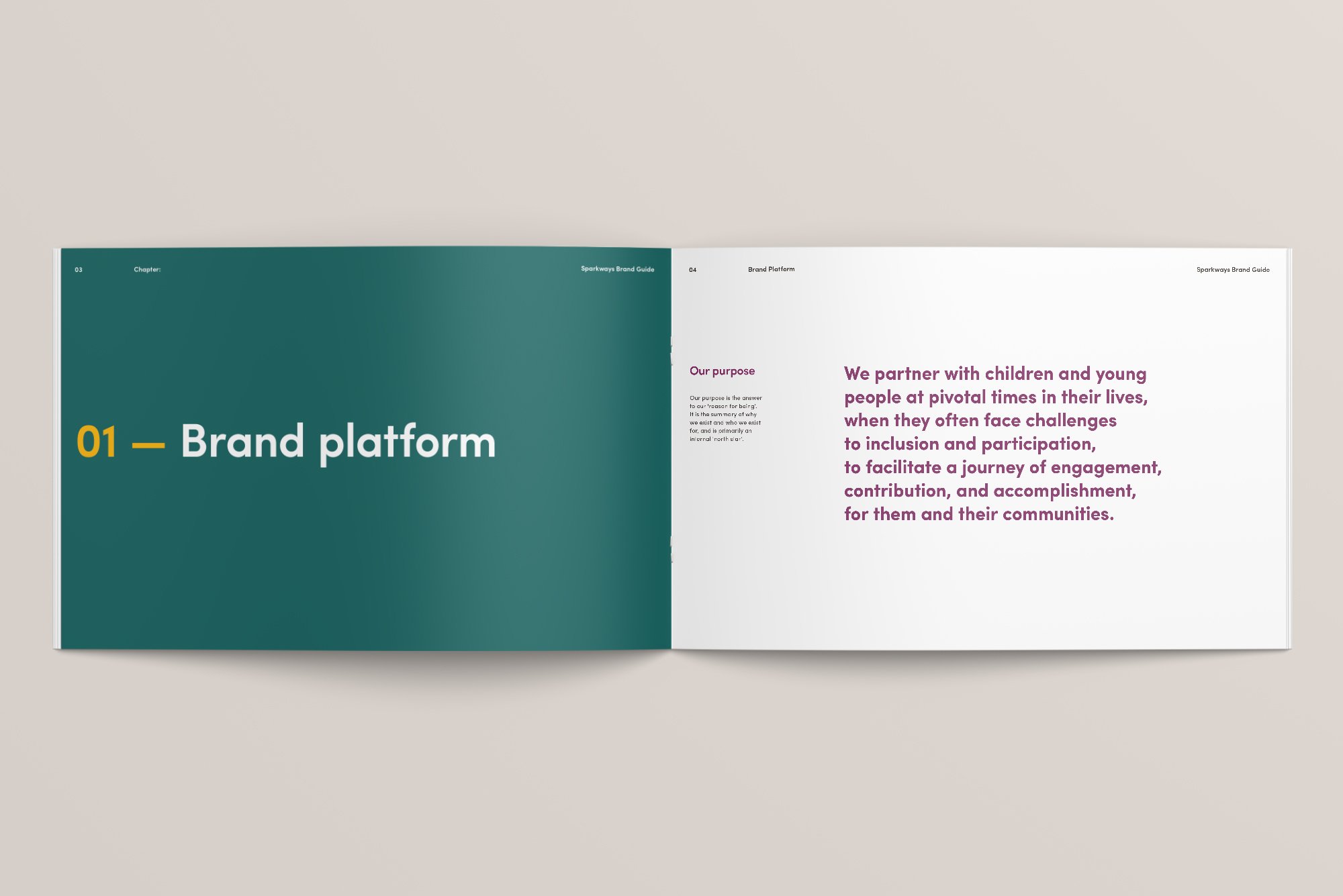
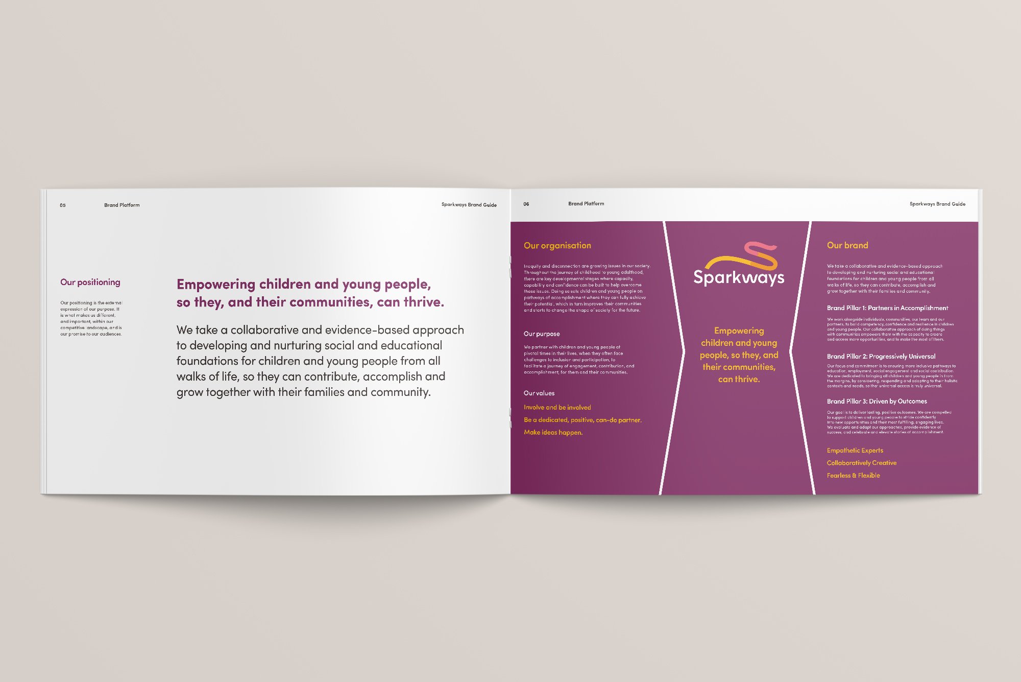
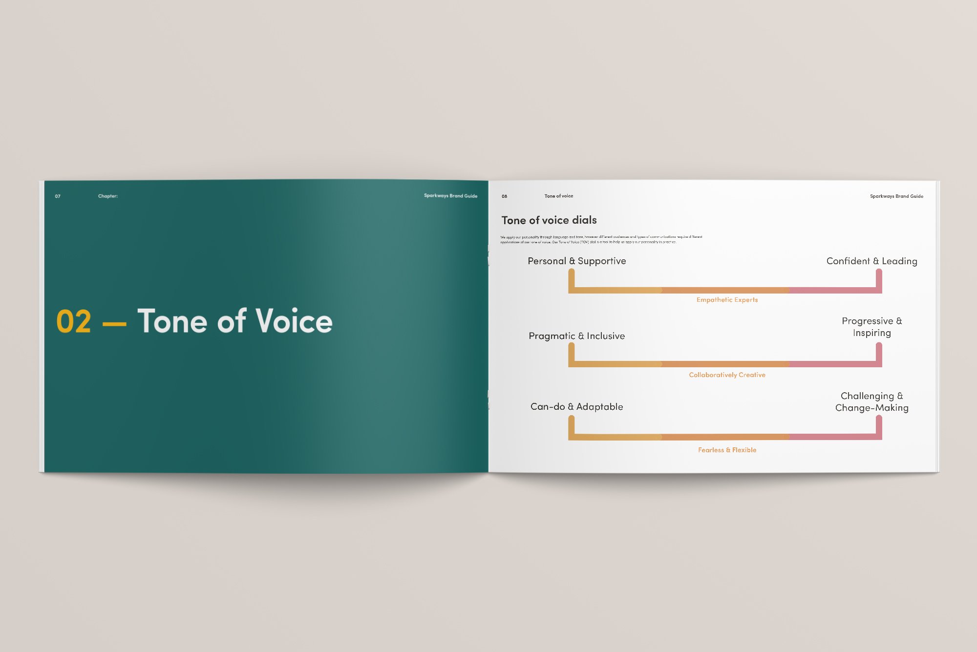
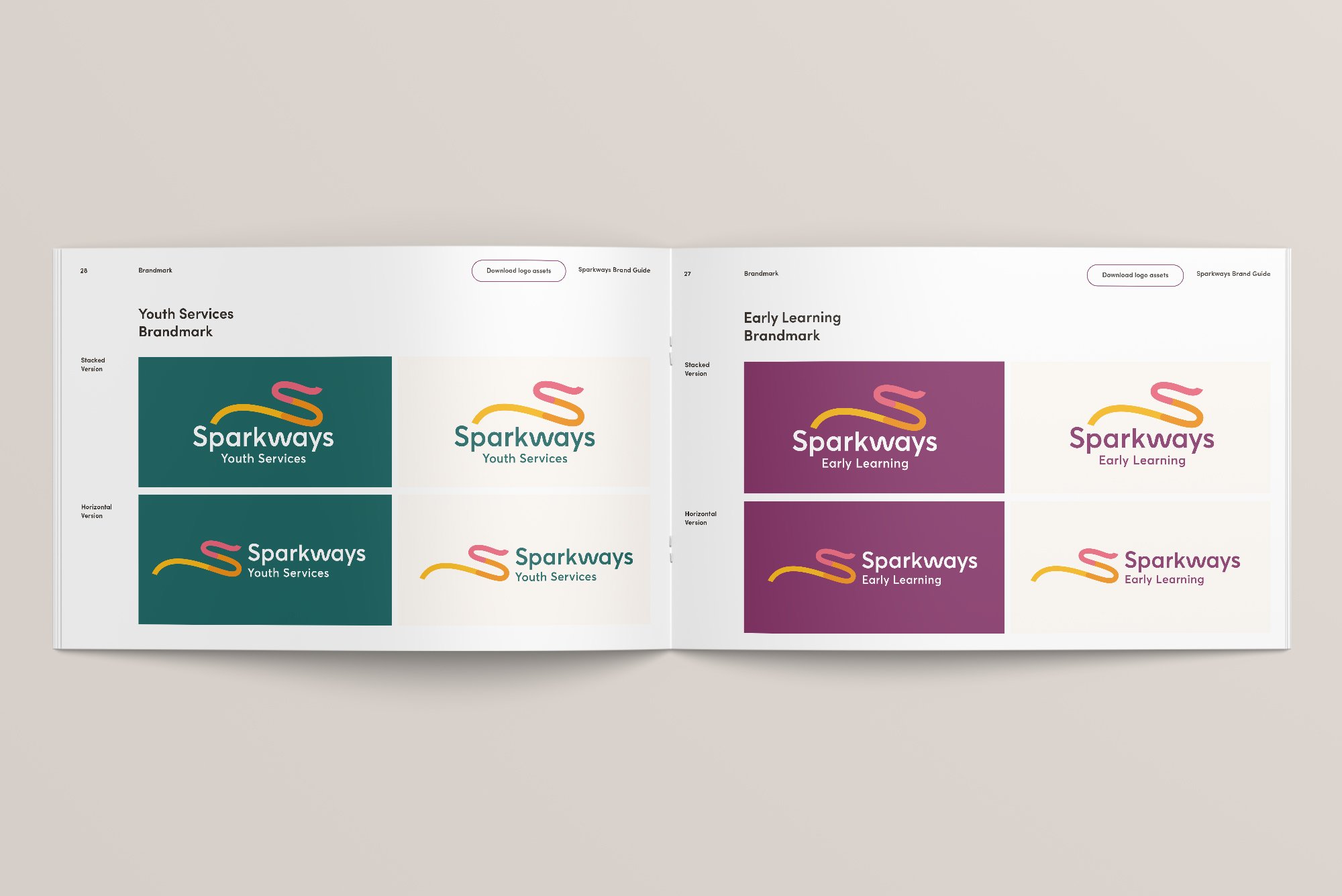
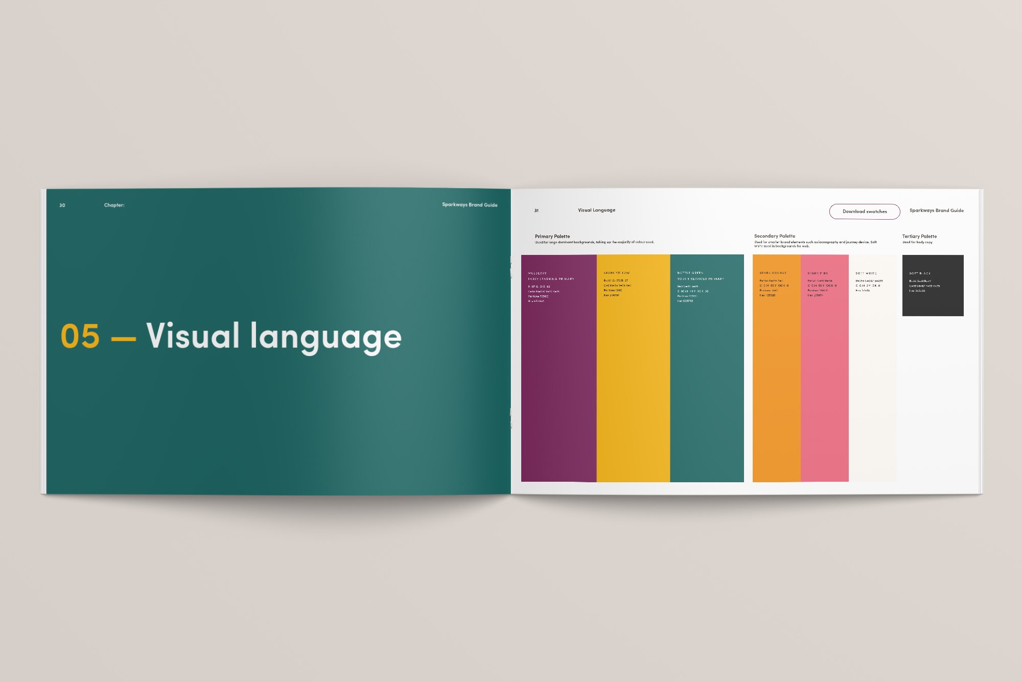
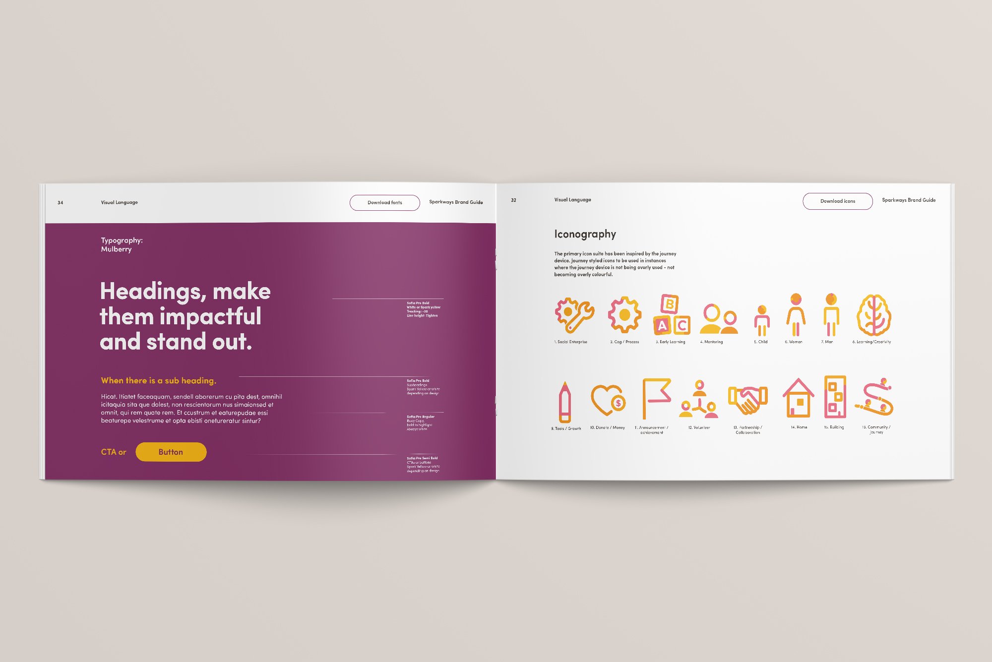
The comprehensive brand overhaul for Sparkways resulted in a dynamic identity, including a redesigned logo and adaptable brand language. The new brand direction successfully unified Early Learning and Youth Services while maintaining coherence. The logo's hidden storytelling elements and detailed brand guidelines empowered stakeholders to embrace and communicate the brand's essence effectively, resonating across diverse audiences from preschoolers to corporate partners.
Work completed with Storyfolk Studio


Other Work
-
![]()
Change Coffee – Branding & Packaging for World Vision Social Enterprise
-
![Graphic Design and branding suite for Alto Health applied to digital and print]()
Alto Health – Branding & Website Design for Sydney based General Practice
-
![Snow Kids logo design for the brand shown with blue shapes and young trendy kids wearing the gear]()
Snow Kids – Branding for Children's Adventure Clothing Ecommerce Store
-
![Horizon NL - Renewable Energy Provider Branding logo placed on picturesque setting of windmills and solar panels]()
Horizon NL — Renewable Energy Provider Branding
-
![West Recruitment – Branding showcased across letterhead, business cards and brochure]()
West Recruitment – Branding & Icon Suite Design
-
![Shhh Silk — E-Commerce Branding & Packaging shown in artistically arranged image with a silk pillow]()
Shhh Silk — E-Commerce Brands Rebrand & Packaging Design
-
![ION BLUE - Renewable energy introduction animation car driving to charge station]()
ION BLUE - Renewable energy introduction animation
-
![Costafox — Logo design and branding shown with gold foil on blue stock]()
Costafox — Property Developer Branding, Website & Custom Corporate Font Design
-
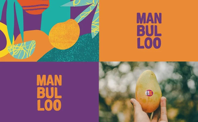
![Manbulloo Mango Branding & Packaging design on mango box isolated on blue background]()
Manbulloo Mango Farm Production Branding & Packaging Design
-
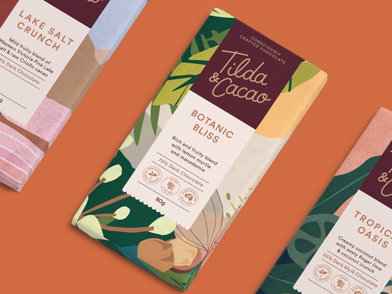
![3 vibrant Chocolate packaging design's shown on orange coloured background for Tilda & Cacao]()
Tilda & Cacao – Branding & Compostable Packaging Design for Hand Crafted Chocolate
-
![]()
Noble Bootleggers – Gin Distillery Branding, Illustration & Packaging Design


Say Hello!
Looking for a freelance graphic designer to collaborate with? I’d love to hear from you.