Expert Tips for Creating Engaging Infographic Designs

As businesses and organisations strive to stand out from the crowd, visual communication has become a powerful tool for engaging audiences. Infographics, in particular, have gained significant popularity in recent years due to their ability to present complex information in a visually appealing and easy-to-understand way.
Effective infographic design goes beyond creating aesthetically pleasing graphics. It involves careful consideration of data visualization techniques, information design principles, and creative design elements that capture the attention of your target audience. Let's explore what makes a successful infographic design in this article.
Key takeaways:
Infographics are valuable tools for engaging audiences with complex information.
Effective infographic design requires a combination of data visualisation techniques, information design principles, and creative design elements.
A well-designed infographic can capture the attention of your audience and communicate your message more effectively.
By following the secrets shared in this article, you can create engaging content that effectively communicates your data.

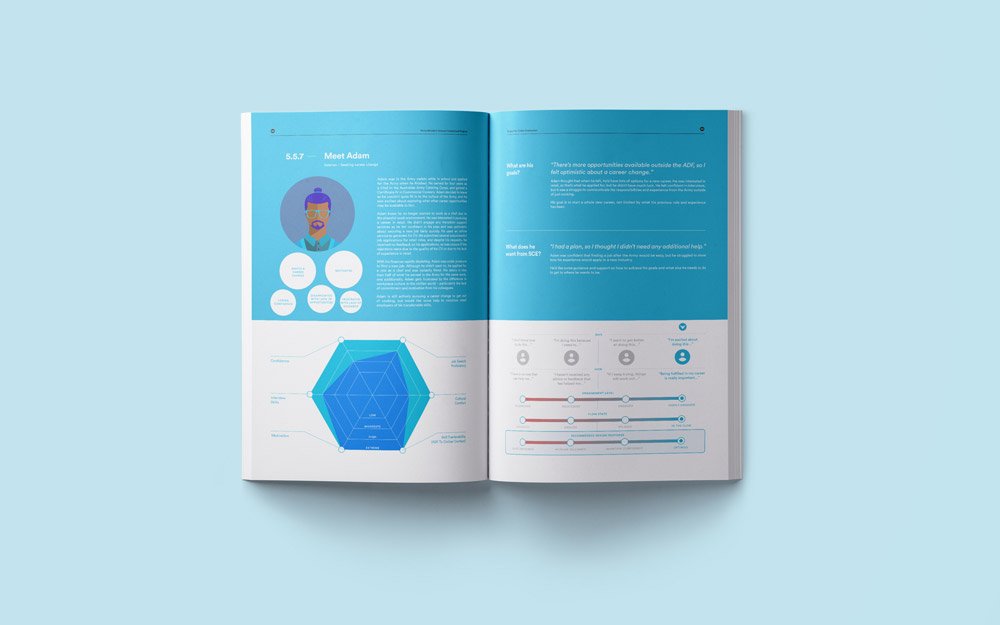
→ User journey infographics from my work with the Australian Government Veterans Affairs, view case study here.
Understanding the impact of infographic design
With a background as a graphic designer specialising in strategic communication, I've gained valuable insights into the impact of a well-crafted infographic. Infographic design, in my view, stands out as a crucial tool for presenting complex information in a concise and captivating manner. Success in this realm isn't just about mastering information design principles; it's about skillfully weaving creative graphic elements to enhance engagement and bring information to life.
The impact of infographic design is evident in both successful and unsuccessful examples. Well-crafted infographics leave a lasting impression and swiftly convey insights, while poorly designed ones may fail to communicate the intended message. It's crucial to understand how design choices influence the final product.
Optimising strategic infographic design for better engagement
Leveraging strategic thinking in infographic creation is essential for visualising processes and simplifying information for the target audience. This approach is particularly impactful when communicating complex ideas, guiding the designer to present intricate concepts in a visually digestible manner.
To effectively employ strategic thinking in infographic design:
Stay on top of data sets, ensuring accuracy and relevance in visual representation.
Create punchy messages tailored to the audience's needs and preferences.
Design visuals that are engaging and shareable for wider dissemination.
Encourage user engagement through interactive elements.
Embrace the principle of "Show, Don't Tell" to convey messages through impactful visuals.
A strategic approach to infographic design involves meticulous planning:
Design the flow of information with a focus on a logical and coherent structure.
Maintain a clear purpose and avoid unnecessary clutter to keep the infographic focused.
Embrace a clean design aesthetic for enhanced readability and comprehension.
Incorporate engaging information and data from reputable sources to establish credibility.

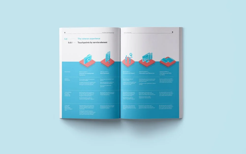
→ Service catalogue infographics from my work with the Australian Research Council, view the case study here.
Incorporating creativity into your infographics
Creating visually appealing and informative infographics is crucial for successful visual communication. To ensure that your infographics engage your audience, incorporating creativity is key. Here are a few techniques to infuse creativity into your infographics:
Think outside the box: Don't be afraid to experiment with new and innovative design elements. Consider using unconventional shapes, layouts, and color schemes to make your infographic stand out.
Visual metaphors: Incorporating visual metaphors is a great way to convey complex information in a simple and engaging way. Use icons, illustrations, and animations to make your data easily understandable.
Custom illustrations: Creating custom illustrations that align with your brand or message can make your infographics highly engaging. Ensure that the illustrations are in line with the information presented to strengthen the overall message.
Typography: Experiment with typography to make your infographics more visually pleasing. Experiment with size, style, and placement of text while still allowing the text to be readable and easy to understand.
Incorporating creativity into your infographics improves the visual appeal and readability and makes them more engaging to your audience, leading to better communication and retention of information.

→ Hand drawn infographics from my work with Necessitating Change’s book design, view the case study here.
Enhancing data visualisation in infographics
As we discussed earlier, effective data visualization in infographics is crucial for capturing the attention of your audience and effectively communicating your message. Here are some techniques and strategies you can use to enhance your data visualization:
Choose the right chart type for your data: Different types of data require different chart types. Choosing the right chart type will ensure that your data is easy to understand. For example, a bar chart is great for comparing data, while a line chart is suitable for showing trends over time.
Use contrasting colours: Using contrasting colours will make your data stand out and be easily distinguishable. However, be sure to choose colours that are accessible and do not cause problems for colour-blind individuals.
Provide context: Providing context for your data will make it more meaningful to your audience. For example, if you are showing data for a specific period of time, include data from previous periods for comparison.
Simplify your visuals: Keep your visuals simple and avoid clutter. Simplifying your visuals will make it easier for your audience to focus on the data and understand your message.
By following these techniques and strategies, you can create infographics with effective data visualization that effectively communicate your message and engage your audience.
Transforming complexity into clarity
In summary, a thoughtfully crafted infographic serves as a potent tool to convey intricate information in an engaging and accessible manner. By adhering to the insights shared in this article, you have the potential to create infographics that captivate your audience and effectively convey your message. If you have complex ideas that require simplification and visual storytelling for optimal engagement, explore more about my infographic services here or feel free to get in contact with me here. Let's bring your information to life visually!